


While creating slides for an upcoming keynote on visual data storytelling I had a revelation! One of the main reasons people suck at designing ‘useful’ BI Dashboards is because they fail to #getbeyondthetrend. Have you ever noticed that 90% of BI dashboards only contain trends? They focus on why something happened, but not on how to fix it, or what the overall goal. If you are one of these people, this article is for you.
Nine years, 8,000+ students, and 600+ enterprise dashboards later, I’ve concluded that the obsession most people have with trends is feeding two things. One. Analysis Paralysis. Two. KPI overload. This is particularly true in the field of business intelligence. Most people are so fascinated with looking at vasts amount of data, they simply forget the core purpose of their BI dashboards. Take action and improve the business.
It’s 2018, let’s please commit to #getbeyondthetrend!
Below I’ll show you some quick, practical solutions to overcome this and other known inhibitors while designing useful BI dashboards.
1. You Don’t Tell Data Stories

It’s no secret that visual data storytelling is one
of the hottest skills in 2018.
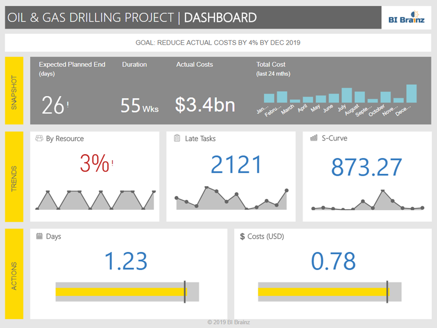
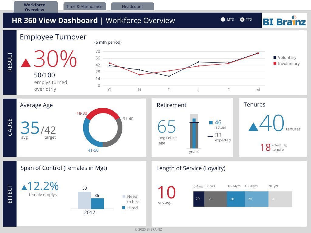
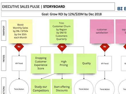
- Snapshot - Where are you today?
- Trends - How did you get here?
- Forecast - Where will you end up?
- What if - What do you need to change?
After creating the very popular KPI Blueprint template, I’ve since developed a visual storyboard template that makes this process easier.
2. You’re a ‘Data Hoarder’, but you don’t know it

You feel that you need to see 'all' of the data or you might 'miss something. After all, you are accountable for your metrics.
This fear leads to feelings of anxiety and results in KPI/metric overload in your data visualizations. If you are truly working to make a real impact in your organization, you should set up alerts to be notified only when an exception occurs that truly requires attention. The rest of the time, you should be focused on taking the right actions to improve your business. The only thing worse than looking at too much data at once, seeking the ‘why’, is taking the time to analyze each data point to figure out the ‘how’, aka action.
Another great suggestion is doing what David Allen refers to as a ‘mind sweep’ in his famous GTD (Getting Things Done) book. In the business intelligence world, it is the act of creating a list of all the reports and dashboards that you use daily, then eliminating the 80% – 90% that are ‘least’ used. The mental relief from this one exercise will provide greater clarity and help to pave the way to gaining greater insights from your remaining data visualizations and reports.
HINT: If you spend more time analyzing data than doing your job, then your big data visualizations suck!
3. Your KPIs are 'Actionless'
Before you start visualizing any data, you must be sure that 'what' you are visualizing in correct.
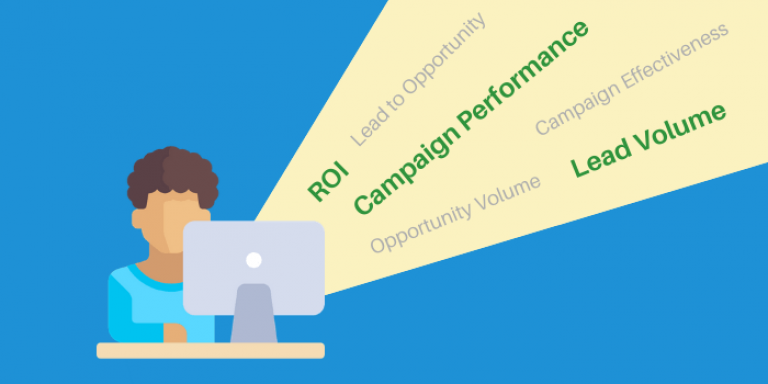
Unfortunately, most folks equate ‘lots of data’, with the need for ‘lots of KPIs’! WRONG. To be truly effective, the more data you have, the less KPIs you should track. I personally recommend using the Steven Covey WIGS (wildly important goals) method, which has proven that the average human being can only focus on 2-3 goals at a time. Only when a goal is accomplished may it then be replaced by a new one. This type of focus can also be found in Warren Buffet’s ‘2 List Strategy’, one that I employ myself.
The first step to reducing your KPIs, is knowing exactly how many KPIs you are tracking today. To do this, I recommend that you download our free BI Dashboard Formula blueprint. It is a simple, yet powerful excel sheet that we use with our clients to help them understand the magnitude of their ‘KPI’ problem. It is a good place to start to eliminating those useless KPIs!
4. You Value Pretty Charts more than Insight

Like gauges, trend lines are sexy and easy to interpret, but they have one major flaw.
Without being intentional, they contain no signs of clear actions to take. It seems that most folks use it as a ‘cover your arse’ tactic to say ‘I saw it coming, no problem’. The real question is: ‘What did you do about it? What are you going to do about it? or worse ‘Do you know what to do about it?’
The good news is, there is a quick fix for this. We call it ‘smart text’. Smart text is when you add a short explanation of text to the charts and values in your dashboard, so the reader does not have to guess what they are looking at. We teach many advanced techniques about this, and my students are always surprised at how this simple technique can make even a bad chart look better, or provide better insight almost instantly.
5. You Use a Different Tool to Determine Your Next Action

As with 98% of most business intelligence reports and dashboards, after doing some 'data discovery' most users have to leave the application, export data, then manipulate it in Excel to determine what actions to take next.
Not only is this a sign that your data visualizations have failed, but it is also a clear indicator that your data story is incomplete.
One quick way to overcome this is to simply ask any user, what they are currently using today to get the information you need, before attempting to build them something new. Of course, if it is a new data request, this does not apply. However, most of the time we find that simply asking users to show or send you what they are using will provide insights into the actions they need to take.
Last Thoughts…
While many of these reasons and solutions seem simple, if applied consistently you will see an overall improvement in your data visualizations. I purposely did not focus on how to choose charts and add pretty colors, because there are many respected schools of thought that handle those concepts. I do however feel that the five elements I mentioned above, are overlooked and do add great value.
Designing dashboards should be a fun and engaging experience!
Need inspiration? Check out our new story-driven dashboard examples page!
Or click below to find how we can help you!