


An ugly Business Intelligence dashboard can turn your idyllic data visualization dreams into grotesque nightmares, and it’s not just a matter of aesthetic preference. If the user interface is cluttered, disorganized or downright off-putting your ability to understand and leverage data, analytics will be seriously compromised. In my visual storytelling workshops, attendees focus on designing useful vs. pretty data visualizations.
This week, I reveal seven of my top secrets anyone can use to humanize their ‘ugly baby’ and make their visual communication more impactful.
1. Add More White Space

Unless everyone in your audience suffers from kenophobia, you need to take advantage of negative white space. Artistic and perceptual research have demonstrated that white space makes information easier to discern, demonstrates the absence of information and contextualizes data to clarify outliers and give element sizes meaning.
Creating white space on any data visualization or report is one the easiest ways to highlight the most important data. As a rule of thumb, avoid dark backgrounds which can compete with chart colors or make text hard to see. I can’t remember the last time we created a visualization with a colored background! It may be attractive at first, but over time colored backgrounds can serve as distractions, even turning users off.
2. Remove Clutter

Clutter can be defined as disorganized visual elements, such as overabundant lines in charts and repetitive labels, that commonly hide the structure of data. According to some researchers, “Even in a small dataset, clutter can make it hard for the viewer to find patterns and reveal relationships.” Make things easier on your viewer by not overwhelming their right brain with visual data that doesn’t really contribute to the overall meaning.
Here is a list of the most common types of clutter to avoid:
- Remove unnecessary text on charts – For example, you can remove values on the x-axis or y-axis of a chart by simply including the values directly on the chart bars or lines.
- Keep chart colors to a minimum – Focus on highlighting exceptions in the chart vs all the values.
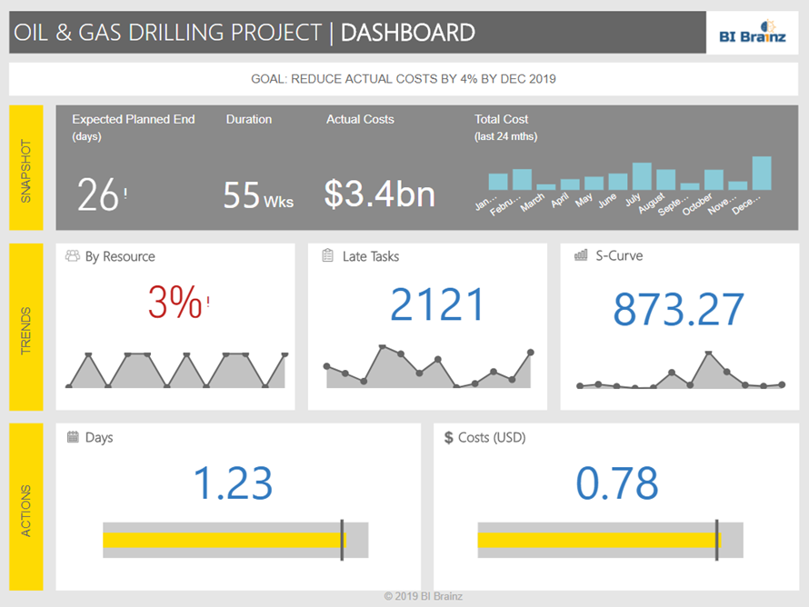
- Check chart proximities – Less is more when it comes to placing charts. Stuffing multiple charts unto a screen makes it difficult for a user to decide what’s important. The use of micro charts, big values, and icons can help to ensure the user is not overwhelmed with detailed charts.
- Limit tables sizes – Rows and columns are for reports. When it comes to visualizations, limit the table length to no more than five rows. Try to avoid using lines in between the tables, which are distracting and add no value.
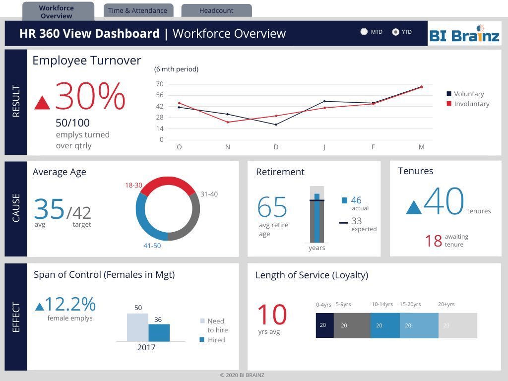
3. Add Icons

Icons represent concepts more succinctly than a block of text does. One study presented at the Third IEEE International Conference on Data Mining even noted that organized icons and glyphs can make it easier for viewers to absorb multidimensional data sets. Luckily, there are many free icon resources online, including:
Of course, you’ll also need to apply these resources intelligently, so check out these great examples of how icon usage can make complex datasets clearer:
At BI Brainz we use icons under two circumstances: 1) When space is available and, 2) when it helps to tell the story better. One of our favorite icons is the thumbs or thumbs down icons. We use it to represent top or bottom leaderboards. Due to the Facebook likes or dislike concept, these icons are globally recognized and users immediately understand what they mean.
4. Use a Set Color Palette
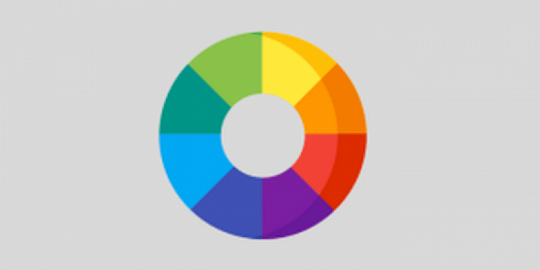
Use color sparingly. Grays, blues, and other neutral tones are easy to match, and RAG (red, amber and green) colors, are good for highlighting exceptions. Above all, keeping your palette simple makes it easier to select contextually appropriate hues, which is clearly important; Harvard research even shows that semantically resonant colors make data easier to retain.
At BI Brainz we tend to default to using one of two methods to choose colors:
- Request a branded guideline from our customer (you can easily obtain this from the marketing department)
- Utilizing sites like Color Scheme Designer or Adobe Color Wheel we create color palettes that work
5. Replace Complex Charts with Simple Ones
Spiders, waterfalls, and 3D visualizations are sexy, but they’re harder to decipher. Psychologists say complex graphs require larger differences for users to distinguish data and shapes. So stick to classics, like, bar, line, spark, and bullet arrangements.
One rule of thumb taught in our visual storytelling workshops, is to avoid ‘exotic’ charts. During the wireframe stage, they look great to users due to the variety they add to the visualization both in texture and colors, but over time they become visual shelfware in a user’s mind; they take too long to discern, so stick to the basics. Similar to icons, most users understand the use of a bar or line chart without needing an explanation. No need to reinvent the wheel.
6. Be Consistent

A readable BI dashboard maintains consistency with respect to text sizes, chart alignments, shapes, labeling, headers, and other elements. As the Web Development Group notes, “inconsistent elements are confusing for the reader.”
Most BI tools have grids or auto alignment options in their toolbars that make consistency a breeze. Use them. While small misalignments may seem invisible to you and the user, the brain recognizes it and subconsciously it can take away from the user’s ability to focus on the data. That is why in our visual storytelling workshops we use a set structure for our wireframes.
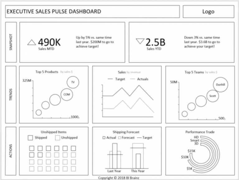
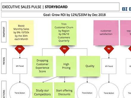
BI Dashboard Formula Dashboard Wireframe Structure
We encourage all attendees to use our templates to avoid the ‘know how’ required to create a perfect layout. Consistency when it comes to data visualization is associated with a ‘clean’ look
7. Design Mobile First

What looks great on a computer might reveal itself to be a very ugly baby on a smartphone or tablet. Since you’re ultimately constrained by mobile device sizes, humanize your data visualization by designing the interface, layout, and other factors around mobile screens of at least 10 inches.
The mentality of designing mobile first started with the iPhone, but it is now a well-accepted fact that if your data visualizations or reports do not work on a mobile device, it will negatively affect overall user adoption. Worst, users will simply see it as antiquated and seek other solutions. While some organizations avoid mobile access to data due to security, this can be viewed as an excuse to remain in the ‘dark ages’. Organizations who do not embrace mobile could find themselves with significant BI shelfware in the future.
Having trouble putting an ugly BI dashboard behind you? Discover more tips for keeping your user interface and analytics data accessible by checking out some of our other blogs, and get your left and right brain thinking in sync with each other. If you want to learn our step-by-step design process and gain access to our 100’s of dashboard wireframe templates, visit our new resources page!