Nov 14-16, 2023 – BI Data Storytelling Accelerator Online Event
Join Mico for our annual BI Data Storytelling Accelerator 3-day virtual workshop. This will be the only
PASSION + IMPACT + ENGAGEMENT
“Data storytelling starts with what you say, what you write and what you draw.
Start with the story and users will trust you.
Start with technology and they’ll forget you.”


 Welcome to my page!
As the co-founder of BI Brainz and our popular BI/Analytics Data Storytelling Framework (BIDS), I’ve been blessed to train 15,000+ data professionals over the last 12 years and it has taught me alot. I love discussing the use and impact of data storytelling on our Analytics on Fire Podcast, where I interview our rockstar students, fellow thought leaders, and some of our executive sponsors.
My true passion is teaching the verbal, written and visual art of data storytelling to drive action. I’ve consulted with and trained teams for companies like Shell, FedEx, Nestle, Qatargas, Ericsson, Procter & Gamble, Kimberly-Clark, and more.
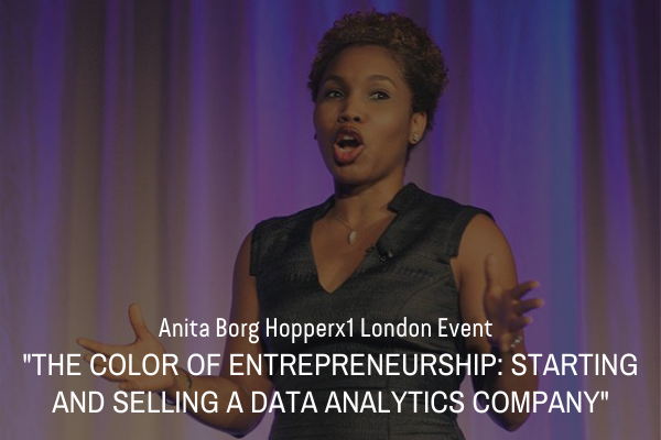
Rated as one of the top data strategy and content influencers on Linkedin by databand.ai in 2022, I’m known in the analytics community for my practical advice and focus on ‘non-technical’ data skills. That has led to some of my favorite top-rated keynotes and speaking engagements including, the Harvard Entrepreneurial Club, the Real Business Intelligence Conference at MIT, Facebook Women in Analytics, the Microsoft Power BI Summit, Booz Allen Inspiration Series and AnitaB.Org Hopperx London to name a few. I recently ventured into TV news where I have served as a data commentator on CNN, MSNBC and other major news stations.
If you’re looking to kick off your event with a bang and keep your audience at the edge of their seats, let’s chat!


Join Mico for our annual BI Data Storytelling Accelerator 3-day virtual workshop. This will be the only

Join Mico in the Fall as she launches her first Linkedin Learning course focused on the Data

Join Mico on April 21, 2023 as she joins a panel to discuss how analytics has evolved


Ranked at #2 on the list, Mico Yuk is the Co-founder of BI Brainz, Host of the Analytics on Fire Podcast, and the mastermind behind the BI/Analytics Data Storytelling Framework (BIDS).Mico actively posts about data analytics, BI strategy, and data storytelling.
As the keynote speaker for the 2022 Society of Actuaries (SOA) ImpACT Conference, Mico shares her background, three key techniques to kickstart your own journey, and why Storytelling is vital to fostering decision-making and motivating actions.
Mico was about to enter the Grace Hopper Celebration when she responded to my request for an interview. She was pumped to attend THE largest gathering of women technologists in the US. GHC is an event run by women for women in the tech space.
Send us some information about your event and requirements and Mico will be in touch.
Ask us a question, or lets arrange a time to talk!