Excited to share the last and final part of my three-episode series on our BI Data Storytelling Accelerator lessons learned. We’ll be digging into the last but most exciting step in our BI Data Storytelling Framework, ‘What you Draw’. Useless visualizations are everywhere!
This episode will give you seven things to avoid and ways to fix them to ensure you bring your A-game when it comes to visualizing your storyboard. Tune in for knowledge bombs galore!
“Do not ideate and plant visual seeds in a user’s head, unless you are sure you can deliver on that visual. If you haven’t learned this, you will learn the hard way.” [10:17]
Subscribe
Download the Analytics Design Guide!
3 Knowledge Bombs
- Mico on Wireframing - Mock-ups are essential when doing your drawings.
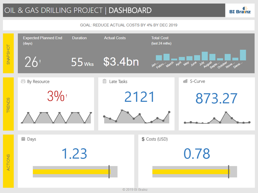
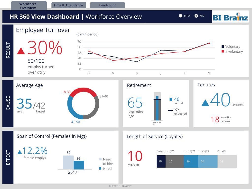
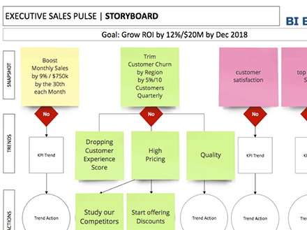
- Mico using a Story-Driven Wireframe - What you draw is more than throwing charts on the screen; you need to have a story-driven visual format.
- Mico on Creating Assets - Time is of the essence, and you cannot afford to keep starting fresh all the time. Having templates will always save your time.
In this episode, you'll learn:
- [05:53] - Never skip the mock-up stage: 90% of us make the mistake of getting directly into drawing without a mock-up. Always make sure you a client signs off before you start on the mock-up and you have some sample data
- [09:34] - Doing mock-up before getting a sign-off on the storyboard and the analytics data dictionary. Without a sign-off, you should never go into the drawing board.
- [11:44] - Starting from scratch all the time: Nothing wastes time than having to start from scratch all the time. To save on time, always treat every project you build like an asset. Every template you build as a team should be repurposed as a template for the users.
- [14:26] - Not standardizing your analytics templates. If you are doing self-service then you need to have an analytics guide and templates to give to your users
- [17:01] - Not having a visual story format: There are four parts of a story in a visual, they include: the goals, the key performance indicator, your trends, and your actions. Always make sure you cover the four parts.
- [19:08] - Underutilizing the advanced tool tech capabilities: Most tools have something they call Smart Insights. We see the feature in Power BI and SAP analytics cloud. For Tableau, you have to do it manually. Smart Insights create a written version of what the data says.
- [21:02] - Skipping actions and making every action visual: There are three types of actions, namely; the reality, wish list action, and fallback. Be sure to identify all the actions and categorize them accordingly.
- Right-click here and save-as to download this episode to your computer.
“If you are pushing self-service without our analytics design guide, it's like putting someone in a car with keys and not giving them directions.” [16:03]
Links and Resources mentioned in this episode:
- Connect with me via LinkedIn | Join my private BI Data Storytelling Mastery Facebook
- Check out Mico’s favorite tools:
- To create amazing wireframes sign up for Moqups.com (to get 20% off use discount code BIBRAINZ20)
- Download our FREE Actionable KPI Blueprint to gather data requirements
Enjoyed the Show?
- Reviews on iTunes are extremely helpful and greatly appreciated! We read each and every one of them!
- Join the conversation by leaving a comment below!


