


Let’s face it. Design is hard. Especially when it comes to designing dashboards and reports for someone else!
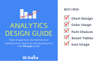
That’s why we created and just updated the Analytics Design Guide version 3 (aka the ADG Template). Enabling self-service and consistency are huge time savers when it comes to reporting. The Analytics Design Guide was created to help BI/Analytics/Data teams standardize and scale their analytics teams by providing a simple set of standards both their developers and superusers can follow.
Comprised of the best tips we’ve learned from designing 600+ dashboards and 1000’s of reports in BI tools like Microsoft Power BI, Salesforce Tableau, SAP BusinessObjects, Excel, Qlikview and many more, this free 50-page Analytics Design Guide Template is a life-saver for the design-challenged.
Using the Analytics Design Guide is simple! Just download the PowerPoint template, replace the details on each slide with your organization’s colors, fonts, etc, then share with your team and users. Talk about a quick win! They’ll  love it!
Should you standardize your analytics?
The average user adoption rate for business intelligence reports and dashboards is around 30%. If it’s ugly, let’s make that 5-7%. You do not need to be an artist to create amazing, well-design analytics if you are willing to follow the clear steps and principles in our Analytics Design Guide. Not to mention, besides brand recognition, consistency will set expectations and provide a template for other users to follow.
Though we originally created the Analytics Design Guide with teams in mind, individuals who simply want to improve their dashboard or report design skills in tools like Microsoft Power BI, Salesforce Tableau, Excel and even SAP Analytics Cloud and more can also benefit!
To make it easy to follow, I’ve outlined below, the six sections you should focus when it comes to designing your analytics. I’ve included a link to a free video as well. Let’s go Chief Data Storytellers!
Step 1: Create the Perfect Layout

Starting with the right layout is the key to great dashboard design! Without it, you may find it hard to decide where to place your data visualizations. The Analytics Design Guide simplifies the layout process by using our BI Data Storytelling framework which we teach in our BI Data Storytelling Mastery online course. By clearly labeling each part of your data story, namely the goal, KPI snapshot, trends, and actions, it makes it easy for your users to understand what they are looking at. In addition, the Analytics Design Guide includes the exact dimensions to use for both desktop and mobile when creating your mock-ups.
The best example of the importance of layouts are children’s coloring books. Coloring books come with preset layouts to guide children to color behind the lines to maintain the design. The Analytics Design Guide is like a coloring book, except for data professionals! It helps you to stay in the lines and avoid overcrowding your dashboard or report. Once you get your layout complete, now it’s time to start adding content or you can skip to the free video training!
Step 2: Choose your Fonts

Now that your dashboard layout is complete, it’s time to add the metadata such as:
- the Title
- the Story parts labels (Goal, KPI Snapshot, Trends, and Actions)
- Titles for each tile
- the Copyright
- .. and other relevant data for your unique dashboard or report
Choosing the right font sizes for your labels helps to avoid cluttering your dashboard and reports. The best example of the importance of font usage is logos. By looking at the font size, type, and color, you can tell a lot about a company. For example, a construction company uses BOLD hard and usually non-italicized fonts for its logos. On the other hand, government entities that tend to be more conservative, use the widely accepted Roman Times, Arial, or Helvetica fonts to portray an austere and no-nonsense image. A company like Google which is all about community and inclusion uses fun bubbly and multi-colored fonts!
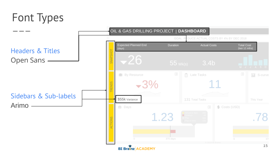
The Analytics Design Guide clearly points out the exact font types, sizes, and colors to be used in each section of your dashboard. If you have a company branding guideline you can easily update those sections. The key is clarity and consistency. It also provides the type of fonts to avoid! Next, you’ll learn how to properly add color or you can skip to the free video training!
Step 3: Master your Color Usage

Congrats! Your 40% there!
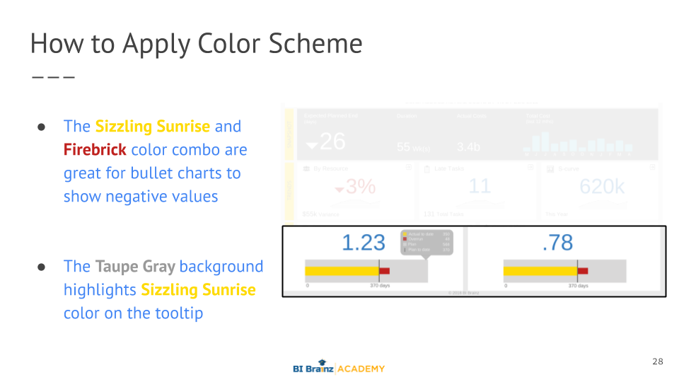
Now that your layout and labels are complete, it’s time to add color to your dashboard (we’ll cover charts in the next section). The Analytics Design Guide provides an easy way to define and apply colors to your dashboard. This is one of the trickiest parts of any dashboard, and an area where most non-design fails. Applying color is an art, but it can be mastered by anyone. The key thing to remember is, less is more when it comes to color.
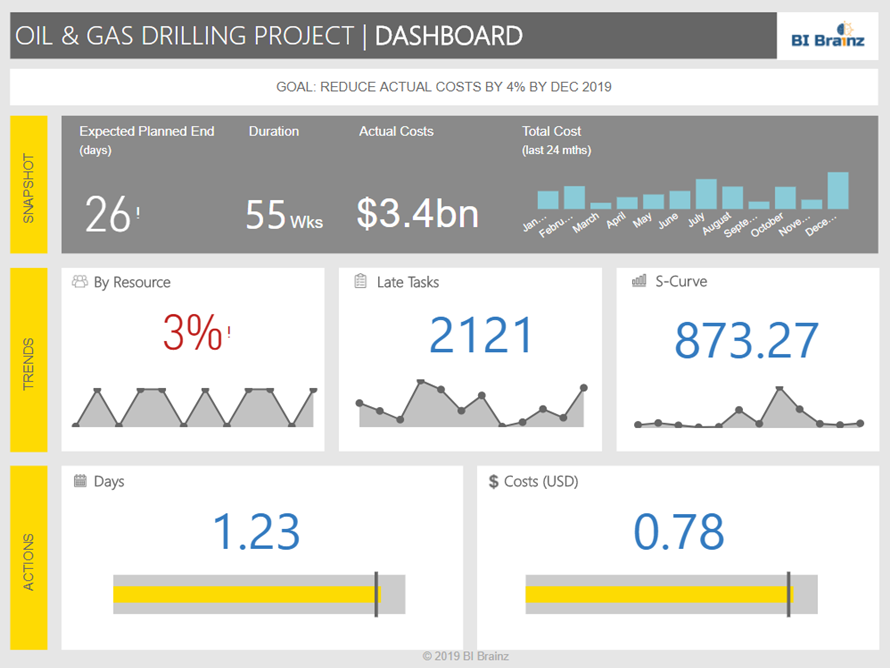
Take this Salesforce dashboard below for example. Notice how they use all muted colors for the layout, reserving the brighter blue, orange and yellow colors for the important data in the chart and map. Our focus for this section is really the layout colors, which are clear but in a muted blue and gray, so the data can stand out!

The Analytics Design Guide first helps you to define the colors, then provides examples of how those colors are used. To update, replace the color swatches, color names, RGB and hex codes, and insert examples of how each one is used on an actual dashboard and you’re all set. We include a number of example pages like the one below to guide you. Next, you’ll learn how to design charts or you can skip to the free video training!
Step 4: Design your Charts
 Design Charts")
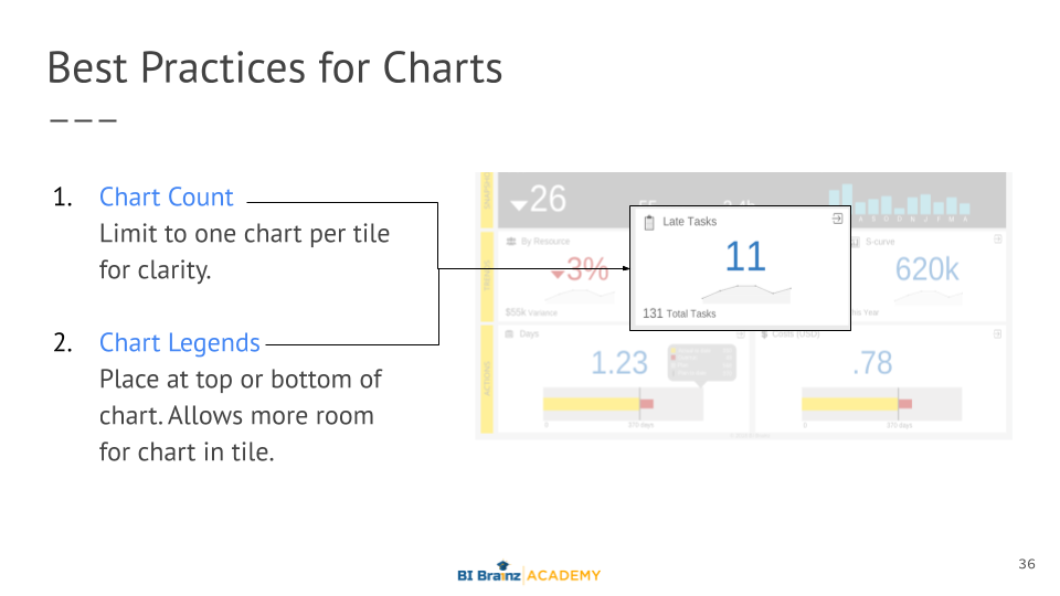
The next step is adding and designing your charts and tables. Using the (K.I.S.S.) Keep It Simple Superstar method is key. Sim-pli-ci-ty as defined by Merriam-Webster dictionary, is the state of being uncomplicated, uncompounded, and easy to understand. Charts need to be as simple and clean as possible. The more data you need to show in the chart, the less colors should be used. For example, BI Brainz has a strict rule of using white backgrounds for all charts.
Most of our designs are inspired by principles from ICBS and Rolf Hichert’s Notation Template. We even keep copies of it in the office. While we don’t necessarily adhere to his lack of color usage, we appreciate his conservative approach to visuals. Today his standards are embedded in tools like SAP Analytics Cloud and Microsoft Power BI using the Zebra BI add-on.
The Analytics Design Guide includes many of our top chart and design tips such as how to use tooltips, when and where to include chart legends, and what kinds of data belong in a tile. It also describes how to format tables to show details. Next, you’ll learn a data storytelling guru trick called smart tables or you can skip to the free video training to see it live!
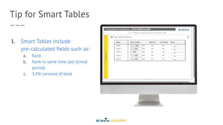
Step 5: Add your Smart Tables
 Add Smart Tables")
The next step is adding and designing your charts and tables. Using the (K.I.S.S.) Keep It Simple Superstar method is key. Sim-pli-ci-ty as defined by Merriam-Webster dictionary, is the state of being uncomplicated, uncompounded, and easy to understand. Charts need to be as simple and clean as possible. The more data you need to show in the chart, the less colors should be used. For example, BI Brainz has a strict rule of using white backgrounds for all charts.
Most of our designs are inspired by principles from ICBS and Rolf Hichert’s Notation Template. We even keep copies of it in the office. While we don’t necessarily adhere to his lack of color usage, we appreciate his conservative approach to visuals. Today his standards are embedded in tools like SAP Analytics Cloud and Microsoft Power BI using the Zebra BI add-on.
The Analytics Design Guide includes many of our top chart and design tips such as how to use tooltips, when and where to include chart legends, and what kinds of data belong in a tile. It also describes how to format tables to show details. Last but not least we’ll take a look at how to use icons or you can skip to the free video training to see it live!
Step 6: Choose your Icons
Based on customer feedback, this is one of the most eye-opening and fun actions of the guide! Icons are not for every dashboard, but when used correctly can make your designs stand out. The challenge? Finding icons can take a while. That is why the Analytics Design Guide not only provides clear guidelines ad examples of how to use icons, but it also provides links on where to find free icons if your organization does not already have an approved set.
Today, icons are used all over marketing and social media to create simple visual queues that catch our attention. When it comes to dashboards and reports, icons can be used to either replace certain words or clarify them. See one of our most popular blog posts – Can Great Icons Really Save Your Data Visualization?‘ for more details on icon usage.
The Analytics Design Guide gives you the exact type, style, and pixel size to use when choosing icons. Again, not every dashboard or report needs or has space for icons. Like color, less is more. In a future blog post, we’ll cover some advanced uses of icons on the dashboard to replace data, but right now you should focus on mastering the basics.
Some last thoughts 🙂 ...
Well, that’s pretty much it. I’ve mentioned our free video training for those who want to see it live! The Analytics Design Guide format is set up to both educate and guide. As you can see, each section starts with a definition, clear guidelines, and finally ends with some best practices right from our BI Brainz design team!
Our goal is to have designers and developers use the proven story-driven design approach we teach in the BI Data Storytelling Mastery online course in their dashboards and reports.
Click the button below to access our free video training or download your copy of the FREE Analytics Design Guide Template!
Do you know anybody who can benefit from this post? Please feel free to share it! Sharing is caring.